
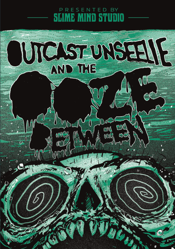
Outcast Unseelie and the Ooze Between can be found on Kickstarter alongside Dark, Damp Doom. Full disclosure, I backed it. It can also be acquired from all the normal places. The kickstarter is closed now, but you can find it at RPG Trader.
~ 1800 words. 10 minutes to read.
I first stumbled across this adventure during the Puzzle Dungeon Game Jam last year. At first, the imagery snagged my attention (go go Cameron Maas), but also made me go… I don’t know if this is something I want to support, because I have a weird aversion to fae adventures and with Unseelie in the title, I hesitated. I blame Beach Sorcerers for that.
But the art was just too damn cool. So, I decided I’m going to judge a book by its cover and not its title. Jesse’s layout work does a fantastic job of utilizing that art.
Note: I started this review in July while I was working on my own Kickstarter and had to back burner it while I finished up my obligations. In that time, Ten Foot Pole also reviewed it and while I’m more positive overall because of my personal tastes, I also agree with a lot of what he says. The difference is probably that I fall on the “I will go out of my way to run this” side of the fence.
What is it?
This is a Shadowdark adventure for levels 1-3. It is also a creepy puzzle dungeon with an ooey-gooey theme to ooze its way into your Nickelodeon green-slimed heart. Aside from ooze puddles, there are fae trying to screw with the players. Like gnats. Swat them away.
Unique Features?
Over the past year, I’ve noticed more and more Shadowdark creators adopting the best practices of Necrotic Gnome’s & other OSR adventures’ design. This includes the introduction of a timeline to tell the story thus far rather than a standard Background.
There are some dungeon oddities due to the ooze and fey that are outlined upfront as well. You’ll need to keep track of them. The physical copy contains a bookmark I believe to assist. That may just be a KS reward though. I’m not entirely sure on that front. Regardless, just know there are a few things to consider and they are helpfully marked for you in Green & Red. Often, I point out low effort design considerations, this is a high-effort one that goes above and beyond and helps the GM run the game. I wish more creators considered the design in their layout.
Design will not make a bad adventure good, but it will make a good adventure great.
That said, my copy is not hyperlinked or bookmarked. For digital books, that is almost bog standard for me now.
What’s the story?
Some dwarves struck a leyline while mining. It released this toxic ooze. They abandoned the mountains, but a fae vintner is banished to the mines as a flea. And a rockslide exposed the entrance.
So… Adventure?
The initial hooks will drag you into the adventure through retrieval quests, promise of treasure, or altruism. They all amount to retrieval quests, but the different motivations behind each is a nice way to differentiate them. Someone will offer something that your players will latch onto.
Setup
Okay, after our timeline for backstory, hooks, and dungeon mechanics, we get some NPCs. Each NPC is well defined with their wants, fears, secrets, reward offerings, and location. The only problem for me is they use the standard monster stat block which is great for saving space, but it is harder to read at the table when you are using it. I would just recommend switching them as seen below.
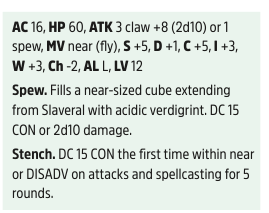
AC 16 HP 60 MV near (fly)
S +5 D +1 C +5 I +3 W +3 Z -2
ATK 3 claw +8 (2d10) or 1 spew.
ABILITIES…
AL L LV 12
It’s technically one more row, but the organization locates everything in the exact same spot within the block so it’s easier to reference. Given some of the other reference changes, I highly recommend adopting this in the future too. Also Z, because that’s my hill. Otherwise, the blocks appear to follow the monster math and be well structured. Also also, why does Shiv’s Bewilder ability have a DC 14. All the other creatures follow the standard DCs. Shakes an angry fist at the clouds. “SHIIIIIIVVVVVVVVVVVVVV!”
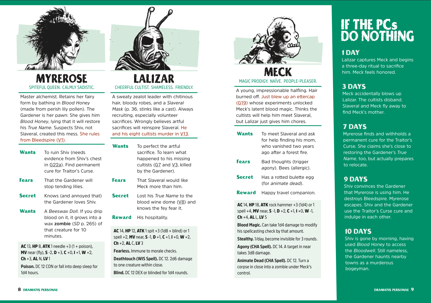
There’s also a timeline for how the NPCs will act if the players do nothing. Nice to have an order of operation so they don’t feel like videogame characters sitting around and waiting for something to happen. I mean a GM technically has enough with the wants, because the NPCs can be working towards those. This extra timeline seems to follow their wants as well so it helps the GM pace it out. Highly useful.
Also, the art is beautiful in this. Cameron Maas did a fantastic job with this book, but I want to highlight good use of an accent color real fast from Jesse. That side bar matching to the top and bottom bars is chef’s kiss.
Room Keys
The first area we get is the recently exposed Gatehouse. Normally, I gripe about map placement. Here, the map is on the inner cover pages, so we’ve already seen it. I did have to flip back to the beginning and this is where I enjoy a well-hyperlinked adventure.
The page utilizes a 2/3 column ratio, electing to use the 1/3 for art, notes, and a small map to orient you alongside the keys. The keys follow a standard description of the obvious, followed by detail… here I’ll just let the adventure explain it because it does. Right there under Keying Note.
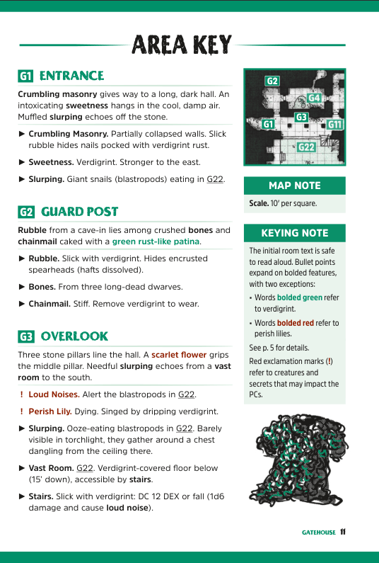
This design is very considerate of the GM running it.
There are 22 keyed areas in the Gatehouse, each has some sort of interactive element to it. There are a few moments where I wonder why the keying follows the path it does (especially around G13-G19). I think it’s because the keying doesn’t follow a path like I would expect, but instead seems to be based more on relative location left to right. Well, it sort of follows a path in that regard too. I can’t wrap my head around its flow.
It’s made more obvious when the keys for G17-G19 break the rules established with the 2:1 ratio seen elsewhere in favor of a 1:1 ratio (2 column) layout. Because in that moment, the keys are a bit of a mix. I’ll wage it is because the goal was to make G22 a full spread and doing anything different would have prevented those 2 pages from being the beauty they are.
Okay, but what about the keys? Are they any good? Or, do they just follow the rules but are boring? How dare you allege the Nickelodeon slime dungeon is boring!
The first areas in the gatehouse are designed for you to learn about the new mechanics and get a sense of the eeriness in the space. They also allow you to see potential directions you may want to avoid. For instance, you can see G22 Drowned Market from G3 Overlook, but it is presented as a “you probably don’t want to dig too deep here. At least, not yet.”
If I have a nitpick, it would be G20 has a lot going on and G19 & G21 are also fairly robust. I tend to prefer the area immediately before or immediately after has a little more breathability in it. You just dealt with a lot of detail, give the brain a small break.
After that, we move into the Villa which contains more delightful art & interesting choices. But we’ll leave it alone so you have something to explore & enjoy. I think Ten Foot Pole also goes into the keying & interesting elements fairly. I think we’re just on different sides of the fence with regards how much we enjoy some of those elements.
So who is this for?
Everyone. Even small children? I SAID EVERYONE! Okay, fair, it might be a bit too adult for children, but this is a disgusting, oozy fun romp. If you enjoy the premise, you’ll enjoy the adventure. Understandably, if you have an ick regarding slimes and ooze and mucus, this might be much for you. A good GM could make it work for even those individuals though in my mind, because you don’t really need to describe the melting, waxy disgusting forms.
There’s a lot of interactive elements to indulge, like going into a curious curios shop. You might be disgusted, but you’ll have a story or laugh at that weird thing in the jar.
If you made it this far, thank you. Now, I’m going to nitpick & nerd out on design. You have been warned.
I adore a lot of this layout because it’s a fantastic presentation of the information to make it usable at the table. I probably could do a full post on just that. Maybe I’ll do a part 2 so I can go over what it does well. Mostly though, I’ve been sitting on this review for a while because I was working on my own kickstarter. I had a moment to breathe so I figured, I should finish the review portion as a minimum.
That said, 3 things I want to highlight:
I’m not fond of the title font as it’s hard to read compared to the ooze drippy one. It’s because the lowercase R is uncommon for modern fonts and most people won’t recognize that is an “R” in “Story”.

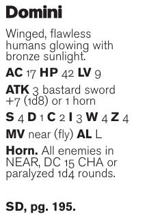
I still dislike the Arcane Library of monster stat block. (Yes, I’m repeating what I said above.) It’s lack of consistency because it’s about preserving space more than making it usable at the table is counter to most of the other design principles on display. To briefly emphasize the point, here’s 2 blocks. You need to make a WIS check. It’s not in the same place on each statblock. Something so foundational to every character sheet to help players find things in the moment not being a foundational element on monsters fights your GM and increases their cognitive load.
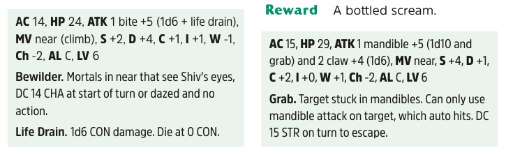
Instead, we should be utilizing a structure. While I use a card format in my adventures typically, this is what I propose.
I adore the keys. It has clear delineations that make things obvious.
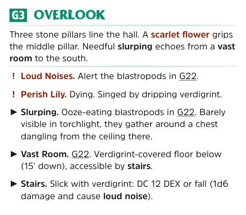
Your title is descriptive to quickly orient the GM. Also provides flavor. The descriptive text is fairly read-aloud capable. It’s also clearly separated with the dividers. Bolding correlates to elements in the bullets well. (I would have preferred it was more Obvious, Hidden, Secret, but it’s good.) And, callouts to the special mechanics regarding the perish lillies & verdigrint are obvious.
Leave a Reply